
plant parenthood
User Experience Design
Designing an application for existing and budding plant parents.
Role
User Researcher User Experience Design
Mission
Lower the barrier to entry for plant parenting
Improve plant content for mobile-first users
Overview
There is an incredible amount of available about plants and general plant care. What makes plant rearing difficult for some is simply synthesizing the overwhelming amount of information.
INDOOR PLANTS can present challenges when considering optimal lighting requirements, following watering instructions, and assessing the home atmosphere.
How might we make plant care more approachable with synthesized and curated information?
Research
My main questions were:
What are the barriers to plant ownership?
What are the pain points in taking care of plants?
What qualities of plants are important to those searching for plants?
What do people want to learn more about regarding plants?
I interviewed 12 interviews in person with a range of demographics to hone in on common threads during the discovery phase.
Discovery
I utilized affinity mapping as a tool to understand patterns across users.
I realized that there were several similarities in those who were searching for plants without any guidance. The internet seems to be an overwhelming place of information and isn’t tailored to a specific individual.
Key Insights:
Learn: Users want information about plants in a synthesized manner.
Care: Understanding watering, lighting, and other care needs are vital to the application’s success.
Thrive: Guiding a user to which plant may work best in their space is a user need to offer more support and comfort with plant parenting.

Plants for whom?
Developing a persona from the research collected was a crucial step in the process.
I wanted to know who we were addressing and what their needs were.
Outlining a few key things such as Alyx’s frustrations and core needs helped shape the next set of questions in addressing jobs to be done.


Before I could get to designing I wanted to walk through Alyx’s journey to see how satisfied they would be while buying plants in the current state of things.
Journey Map
What I learned from mapping out the user’s journey were key moments where information gathering was overwhelming.
This also highlighted the moment where a user may want a curated list of plants based on their preferences.

Ideas + Explorations


Feedback
-
Onboarding
Onboarding of the app was a good introduction to what the application had to offer. The general feedback was that these few pages helped the users go through the application and managed their expectations.
-
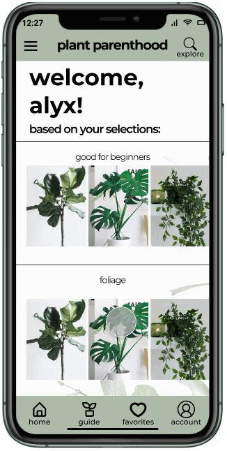
Homepage
The specificity of a landing page was initially unclear. There wasn’t a place for Alyx to know what they had selected and what plants were being displayed based on their selections.
-
Contacting Support
While there is a way to view plants you’ve seen before, the lists are not currently organized chronologically. Adding history to a user’s experience would be valuable.


Key Takeaways
Things that need work:Cyclical journey map: After iterating through wireframes and collecting feedback, it was apparent that a cyclical journey map would be better suited here. With a change in journey map, I can understand the user’s needs better and fill in the gaps for their experience.
Quick Information: While the overlay for the plants are helpful, it’s not as seamless of a process to get to the plant care guide. Need: to rethink the workflow.
Things that worked well:Plant Exploration: The main feedback received was the exploration and homepage did a sufficient job at organizing plant information. It allows for a user to not be overwhelmed with choices therefore having less decision fatigue throughout the process.
Next Steps
Offering location specific details - as a part of feature prioritization, location was not a main concept to address. However, with the testing and user feedback, the next feature to add would be a list of plants specific to a user’s location.
Contact and support - many of the users who tested the app also discussed their needs for contacting a support personnel. While there is a contact menu option, it is not as intuitive to get to. Understanding the user flow around contact/support would be helpful.
Iterate and re-test - iterating through more of these concepts and flows would be a great next step as the project continues to grow and uncover other ways we can help users
learn . care . thrive